WANDERER’S JOURNAL:
EDITORIAL AND PRINT DESIGN
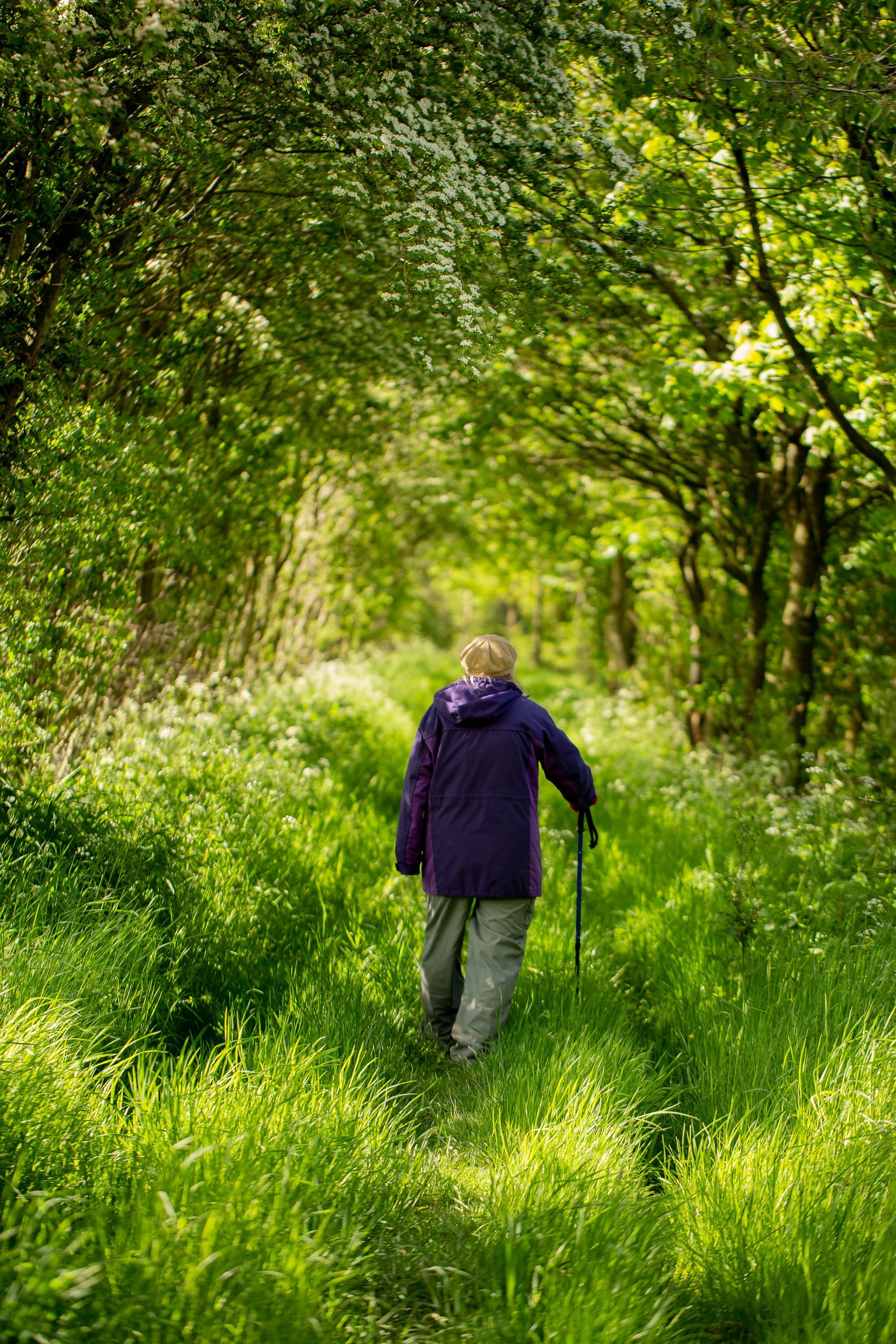
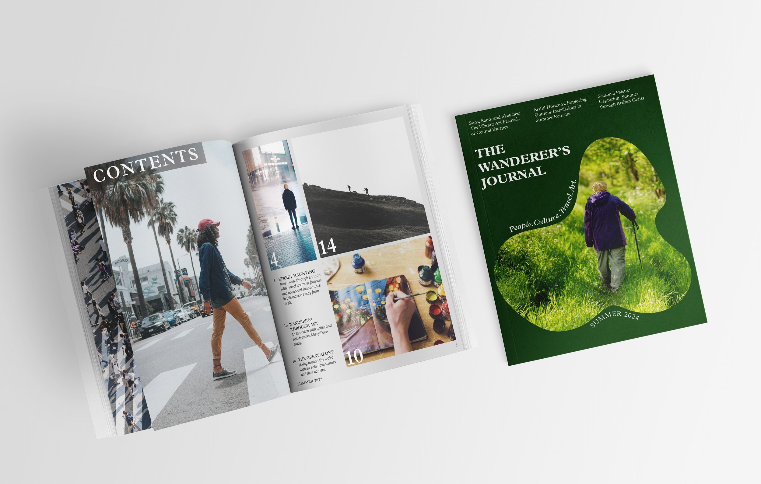
Wanderer’s Journal is a magazine for explorers, artists and walking enthusiasts. It celebrates art, nature and the art of noticing. I designed all elements of the magazine including type, color and layout. I decided on a clean layout design, with a lot of white space that centers the images, while having a lot of variety in layout to surprise the audience and keep them turning the page.
TOOLS
InDesign
Illustrator
Photoshop
SERVICES
Typography
Editorial Design
Print Design
Design Process
I researched nature and art magazines online and in bookstores. I was really drawn to the tone and aesthetics of surf magazines that celebrate nature and the culture/community in a relaxed, airy tone. I also noticed that my favorites were very image centered, showing the beautiful nature that surfers love, with clean but complex layouts.
Design solution
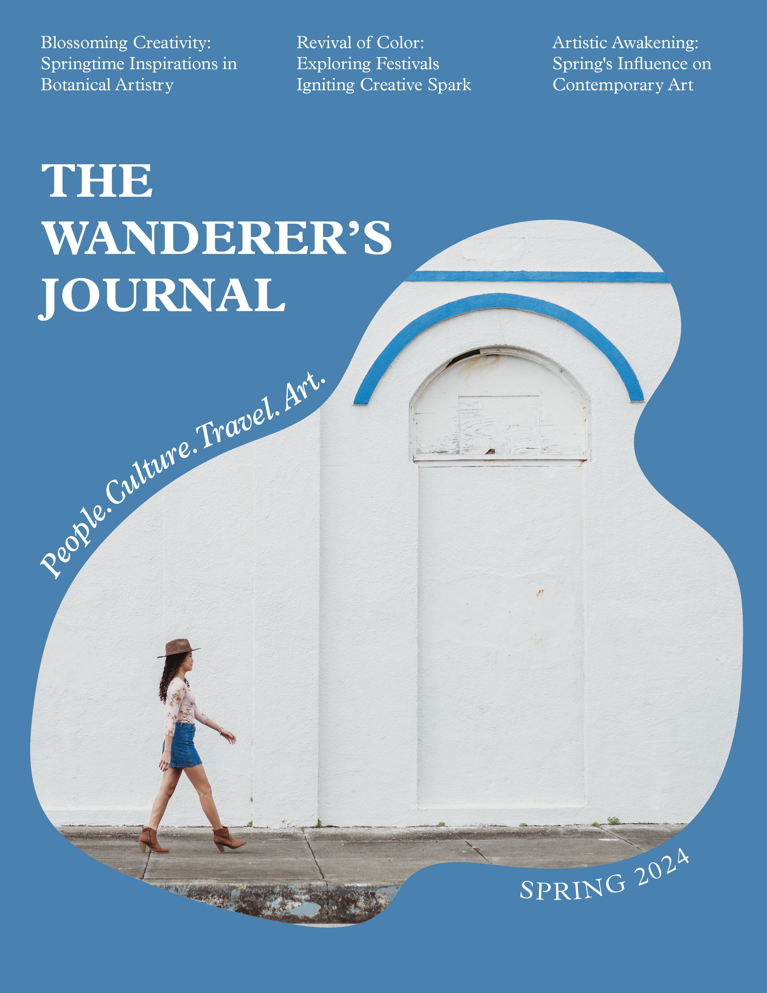
The main design pairs a clean and minimal layout with the organic shapes of nature. The color palette is both rich and vibrant, capturing the richness of art and exploration. The cover layouts for each season will incorporate the lush colors with a different organic shape, framing the theme of the season.
SPREADS
The spreads use a grid system that marries text and images to center the lush subject matter of the magazine. Using the grid as a concrete foundation, I was able to introduce some experimentation. and play in the layouts while still keeping a cohesive system.


